Tips for Decorating with Color
How To Choose Room Colors?
Lots of things can inspire your room color choices. Maybe you spotted a bedding collection that you must have or you have a favorite color that you want to incorporate or perhaps you have a picture or painting you want to use as a focal point. But how do you coordinate these colors? One guideline for choosing room colors is the 60-30-10 rule, which states that a predominant hue should make up about 60 percent of the color in your room. Then, coordinate with a secondary color that makes up another 30 percent—about half the predominant color—and an accent color fills in the final 10 percent. With this goal in mind, explore these ideas for using colors and patterns in your decor for a style that truly suits you.
The paint on the walls makes up a big part of your 60 percent. It's time-consuming and inconvenient to change, so choose your paint color toward the beginning of the decorating process. Because colors can affect the overall feel of the room, having a mood in mind is a great way to choose wall colors. Check out how these popular interior colors affect mood and explore ideas for how to incorporate them into your room's design.
- Blue is widely considered the most relaxing color. Blue’s many hues match plenty of schemes—think of china blue walls in the kitchen, an aqua bathroom, serene sky-blue paint in the bedroom, or a navy hue for the office. Then imagine any color-and-room mix-and-match (A navy wall in the bathroom? Nice. China blue walls in the office? Also nice!) and you’ll see that blue walls can feel straightforward, trustworthy, and relaxing. Shop relaxing blues.
- Green is associated with nature and tranquility. Include this mood in your decor with walls painted in refreshing grass green, zesty lime, traditional hunter green, or calming artichoke. If an entirely green room isn’t a part of your vision, consider an accent wall in a shade that conveys your target mood. Shop soothing greens.
- White walls are crisp, clean, and fresh, and they look especially good with plenty of natural light. White allows the architectural features of a room to shine, and it photographs like a dream. However, too much white and too little light can make a room feel stark and lifeless.
- Beige doesn’t have to mean boring—this versatile color can lean warm, refined, elegant, or modern. Light it well—utilize overhead, floor, and table lighting—so that under-lit corners don’t look murky. Shop subtle neutrals.
- Gray walls can be sophisticated, calming, and contemporary. Darker shades make a room feel smaller, and lighter shades give the illusion of more space. Shop cool grays.
Use your primary color as an anchor to coordinate throw pillows, blankets, rugs, and decor. Large items like area rugs and duvet covers cover a lot of visual space and are available in a wide range of solids and patterns. These are great options to round out your secondary color. Because they are so much easier to swap out than more fixed color elements like paint, carpet, and furniture. Area rugs and bedding are fantastic opportunities to change the look of a room quickly and without a lot of effort.
Throws, blankets, and accent pillows are outstanding ways to incorporate your accent color. They are so approachable and fun to experiment with; these elements make it especially easy to introduce color if you are just getting started using it. For a chic look, you might also unify the room by using the colors in a textile to echo a pattern that's found elsewhere in the room: a mirror frame, side table, or natural-grass woven rug, for example.
QUICK TIPS FOR DECORATING WITH PATTERNS: Patterns can be large or small, geometric or floral, understated or energetic—there are patterns to suit every mood and scale. Use what you know about color to help you choose patterns for each room.
Consider complementary colors—muted blue walls in the bedroom might harmonize with thin stripes of neutral white and rusty, warm orange (blue's complement!) on the duvet cover. Or cheery blue walls in the kitchen might look even cheerier set off with bright-orange and white chevrons on the curtains.
In a small room, like a bathroom, you might like a large, striking pattern on the shower curtain. In a bigger room, use bold patterns on items that are easy to swap out when you're ready for a change: curtains or duvet covers to feature a motif prominently, accent pillows or storage baskets for small touches.
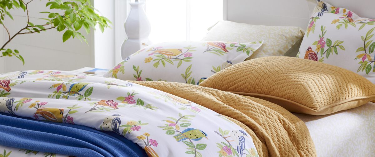
Mix and match prints with coordinating colors to add even more fun to the space. Try combinations like floral and striped sheets, a textured print and medallion design, dual geometric prints, or damask and zig-zag.
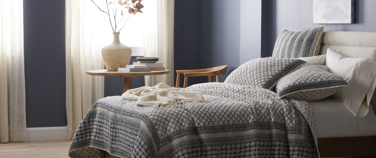
Use patterned bedding to bring personality to the main bedroom or guest room. Choose solid-colored sheets in a hue that speaks to you, then coordinate with printed duvet covers, quilts, or bedspreads to swap out as the seasons (or your moods) change.
Or, flip it. Choose sheets that feature a detailed medallion print, bold chevron, or dreamy floral, then top it all off with a duvet cover or bedspread—pair solid colors, stripes, or patterns to create a bedroom mood you love.
As you head into your secondary 30 percent, you might select colors for a rug, a large piece of furniture, or curtains. Curtains are a fantastic, fast way to incorporate a secondary color. They add vertical visual interest just where the light of the window draws the eye.
The color wheel can steer you toward secondary room color options. When choosing your secondary 30 percent color, you might select colors for rugs, large piece of furniture, or curtains. Here are some popular color schemes and ideas for harmonizing curtains and rugs with walls:

- Monochromatic: Repeat the wall color, either exactly or in a lighter or darker shade. Think sky blue curtains against navy blue walls or an indigo rug paired with pale blue walls. Sheer white curtains look beautiful with white walls, especially in rooms with plenty of natural light. (If you need privacy at the windows, add blinds behind the sheers.)
- Color Neighbors: Choose colors adjacent to the wall color on the color wheel. A yellowish beige might coordinate well with green or cheery orange at the windows.
- Complementary: Pick the opposite color on the color wheel for a complementary color scheme. Against a green wall, a solid red curtain would makes a bold visual statement; for a more subtle look that's still invigorating, find an area rug or curtain that features a red pattern.
- Neutral: White, cream, tan, and gray are neutral colors that coordinate well with most wall colors. Hang curtains in a neutral hue, or choose a subtle carpet in a near-neutral shade.
Color Combination Inspiration: Moody Blues
Explore complementary pairings for blue hues. Bedrooms, bathrooms, living rooms—even covered porches—become soothing spaces when you start with your favorite shade of blue.
- Put a coat of slate blue paint on the walls, then use bedding, accents, curtains, and furniture in bold pink, goldenrod yellow, crisp white, deep navy, or stormy gray for a little pop.
- Deep brown furniture pairs beautifully with dusty blue walls. Try a wood and marble side table, chocolate brown upholstered headboard, or rich walnut bookshelf to add brown without overpowering the room.

- Or, lighten the walls to a gorgeous coastal blue, bring subtle touches of nature into the room with white wicker or driftwood gray accent furniture, top the bed with a solid white bedspread or comforter, then accent with a sea glass or navy and white striped rug, throw pillows, or throw blanket for nautical vibes.
- No matter the blue you choose, a sisal-inspired rug woven of natural materials like cotton or wool is a gorgeous choice to add texture and depth—go for neutral tones or add a bit of color—decorator's choice.
Color Combination Inspiration: Opulent Purples
Deep violet to dusty wisteria—purple can be as bold or as subtle as you wish. Pass on beige walls—brighten them instead with a vintage taupe that hints at mauve. Then, work other colors— purple tones, or not—in with your rug, curtains, and bedding.
- Top the bed with a solid-colored pale blue duvet cover or bedspread, or choose a patterned style featuring giant blooms line-drawn in blue and white.

- Drape a golden-yellow throw blanket across the back of your favorite velvet upholstered settee (gray for subtle, pink for pop).
- Let mauve's rosy undertones inspire you. Bring a whisper of pink into the room. Choose a rug striped in light pink and white, or dress the windows in sheer, flowy layers of light rose and antique white.
- Finish with throw pillows. Choose linen-textured pillows that echo the blue in your duvet cover, embroidered pillows that feature red and pink florals, or deepen the palette with rich purple hues.
Work with whatever inspires you. The color wheel is a guide, but true interior design personality comes from what you love. Monochrome palettes, coordinating neutrals, or bold pairings of green and orange, yellow and pink, red and white, brown and blue: Whatever combination you choose, let it reflect your taste to bring character to your space.
Decorating your walls comes down to balance. You do not need to hang something just to do it. Choose your wall decor with the intention of bringing personality into the room without overwhelming the space.
A photo gallery is a popular choice, but what other options are there for wall decor? Decorate a bare wall with a piece of statement art, framed photos, or interesting wall hanging that pulls in your chosen colors. Consider an accent wall for a pop of color or pattern, textural elements like a woven wall hanging to add dimension, or storage that doubles as decor (think clever bookshelves, hanging a hat collection, or geometric shelves to display trinkets).

Mirrors offer opportunities to brighten your space and create depth. To include mirrors in your decor, consider these tips:

- Pay attention to placement: Hanging a mirror in the right spot spreads natural light throughout the space, so you get a brighter room that feels larger.
- Reflect some color: Placing a large mirror opposite an accent wall can accentuate a bold hue without overwhelming the space.
- Go big: Choosing a single mirror with a large footprint or hanging a series of mirrors gallery-style brighten a space without vibrant paint on the walls.
- Don't shy away from decorative touches: Unexpected shapes and colorful frames add exciting layers to your decor while pulling your secondary and accent hues into the mix.
Let Us Inspire You
When it comes to choosing colors for your decor, the possibilities are endless. Visit our other Guides for more decorating inspiration.